Kokiriki
Repositionner une marque plant-based française pour concurrencer les acteurs premium internationaux. Éviter les codes "healthy lifestyle" trop attendus et affirmer une identité audacieuse, gourmande, résolument moderne.
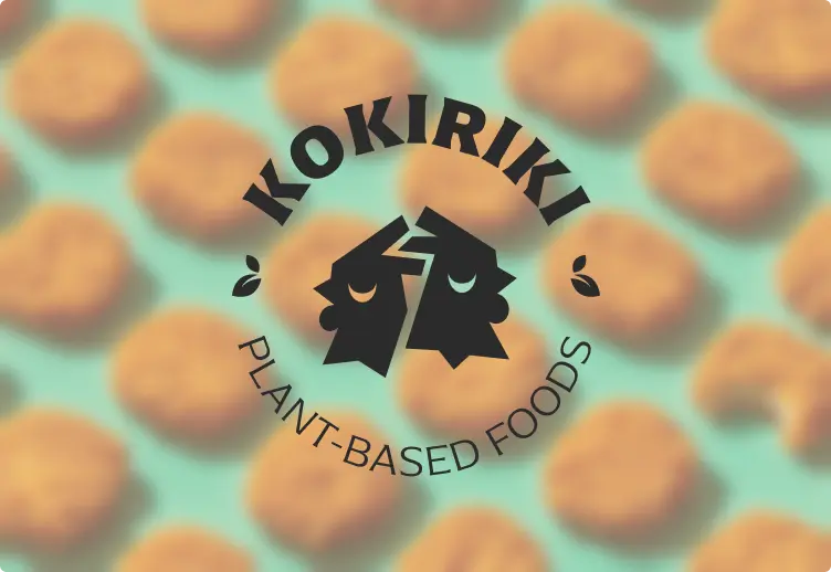
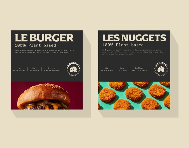
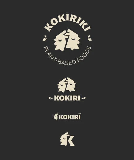
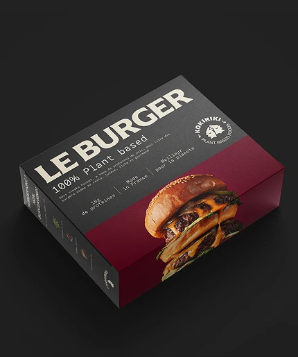
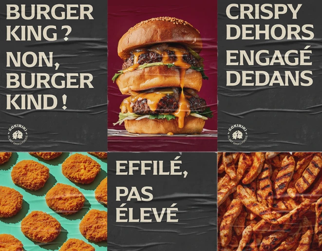
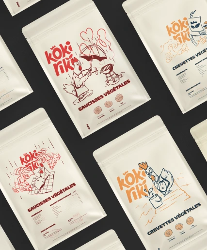
Une identité qui marie tradition charcutière française et audace food tech. Logo-badge inspiré des sceaux de qualité, typographie maximaliste, photographie pop et gourmande. Deux directions explorées, la plus audacieuse retenue : noir, bordeaux, turquoise, avec des visuels qui crient "c'est délicieux" avant "c'est végétal".
L’embarras du choix
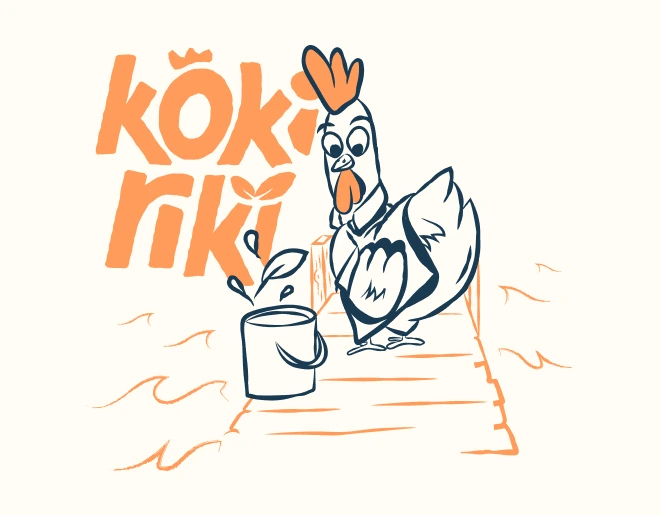
Face à deux directions ; l'une narrative et illustrée, l'autre audacieuse et typographique, j'ai recommandé la modernité. Les images suivantes explorent cette identité premium : noir profond, typo maximaliste, photographie gourmande sans concession.
Projets similaires


Prêt à forger votre marque ?
Que vous lanciez une startup, rebrandez votre entreprise, ou cherchiez un partenaire en marque blanche, commençons par une conversation.
